
It’s another installment in the Sit With A Space series and today I’m bringing something different.
Drum rolls 🥁
A residential space! I figured since we’ve done hospitality and retail it’s time to bring it home. Residential design is in a strange space right now where the basics are settled. It’s is easy to develop a space that works fine and looks fine and the clients are happy. Because of this, I’m often left uninspired by residential design. But, there’s thought-provoking work out there and I do a small dance anytime I discover work that pushes the envelope. I particularly have a soft spot for people who make design decisions I never will and make it work.
And that’s why today’s space is this Milanese apartment designed by Puntofilipino.
When I saw this space, it threw me.
But it works. It works.
The designers say they meant for the opulence of this space to serve as a rebuke to the austerity of midcentury modernism (I don’t think midcentury design is austere but let’s discuss that some other time)
Let’s get in to it.
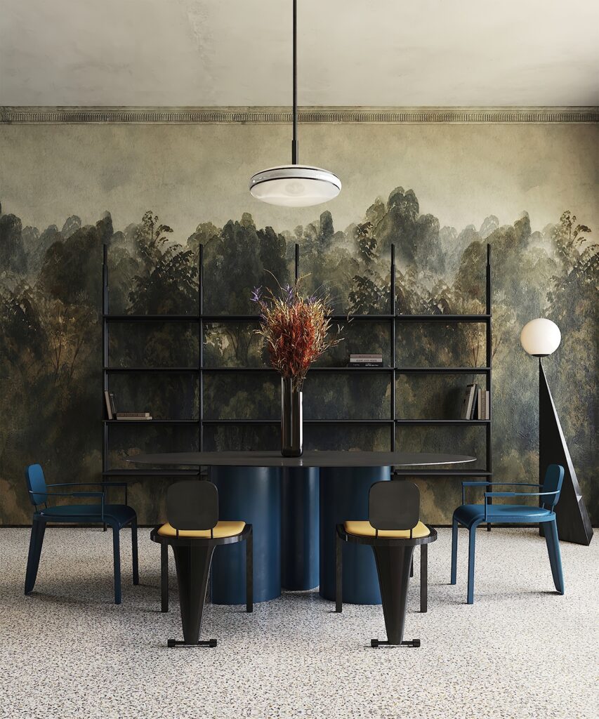
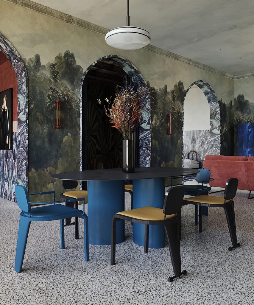
The space feels decadent. The graphic blue of the dining table against the nature mural wallpaper that covers all the walls of the living room is packed with delicious tension.
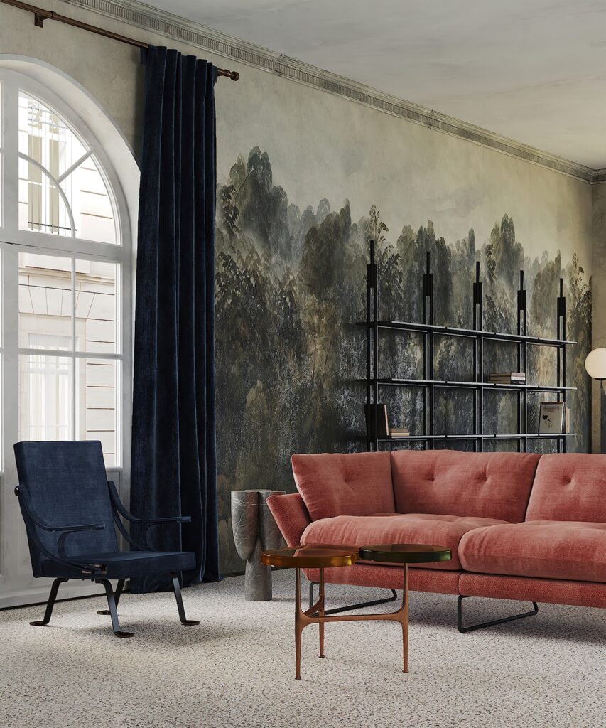
The floral arrangement on the dining table echoes the warm brown hues that will show up across the space. The living area reintroduces these colours to us through bold transitional furniture pieces.
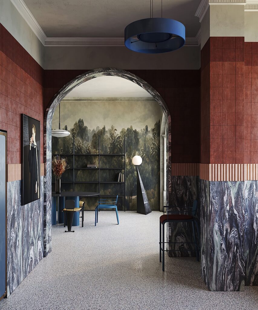
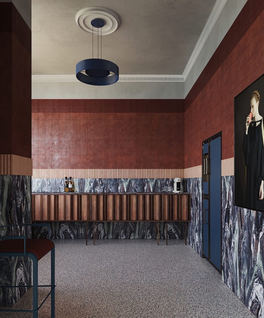
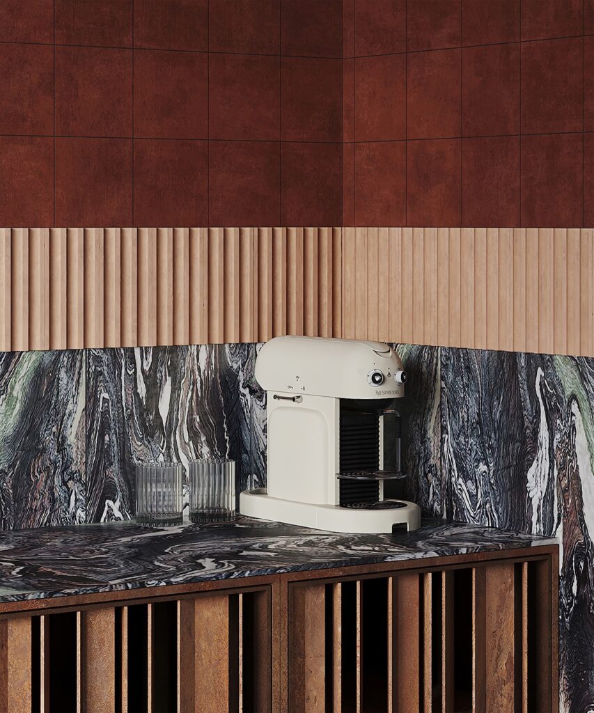
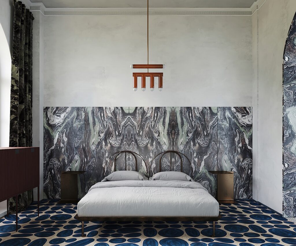
We go through the arched doorways clad in marble that moves through most of the space. The marbling and lime wash are reminiscent of traditional interiors.
There is a surprise. The rest of the walls were treated with terracotta tile with a patterned band. The flooring of the entire space is done in a black and white terrazzo. The walls really do the talking here with furniture pieces often having simple graphic silhouettes in solid colours which is reminiscent of the Memphis design style.
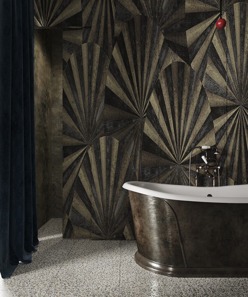
Art Deco elements make their way into the bathroom with a fan-inspired motif across the walls and whist appears to be a brass tub.
I am most impressed by the weight of the colour story, the lighting choices and the lush millwork of the kitchen cabinetry.
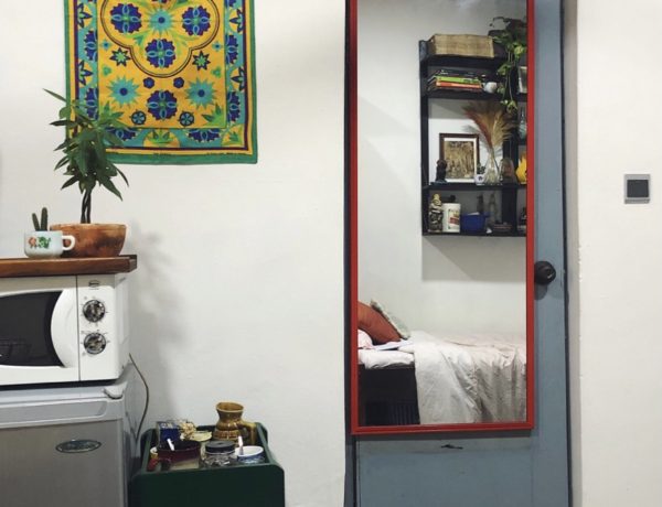
Here are some photos.

2 Comments
Working at Walmart
October 28, 2022 at 10:32 amNice post!
whoiscall
June 22, 2023 at 9:41 amThanks!