White is a great color. For styling your space it is even better. It’s great for giving you that clean, open look we all desire, fantastic for creating the illusion of a bigger room and perfect for pictures. However, white is in no way a simple color to choose. Yes, you can pick the wrong white for your space. But there are ways you can avoid this visual and financial disaster. For this guide I used the Dulux 2015 Color Guide. Keep reading to for rules to choose white paint.
RULE 1: CHECK YOUR UNDERTONES
Under tones are muted colors that lie beneath a color’s hue. You’ve probably noticed some purple hues look bluer than others. Well, for those purples, blue is a stronger undertone. White can be classified loosely by undertones; true whites, cool whites, warm whites and the middle ground which are greige whites.
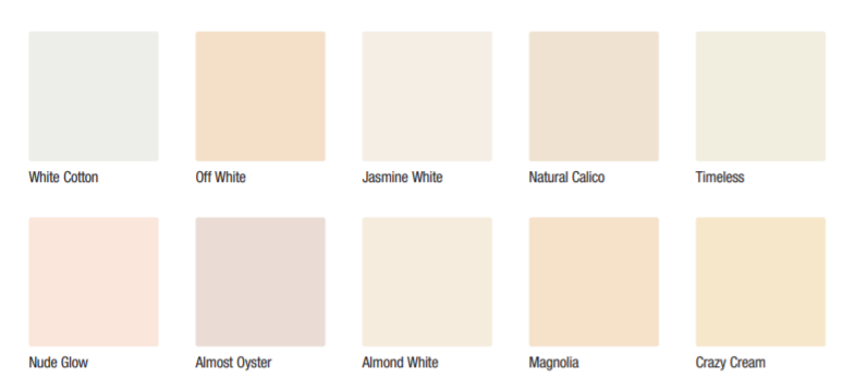
True whites stay true to their names. These are white paint colors which have little to no undertone. They are best for creating that crisp look that you find in galleries. They also help to tone overly yellow light down. However, they can look overly cold or stark. So be sure that is the look you want to go for. From the whites in the neutrals section of the color chart the closest to a true white is the color White cotton. However it reads a a bit grey. I might be wrong because online samples often look different.
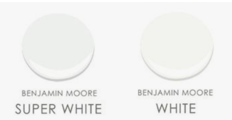
A true white would look like Benjamin Moore’s “White” or “Super white”. Super white is a whiter true white.
Next up are the greige whites. Not quite cool or warm. They read as neutral and pair well with both cool and warm design schemes. They are perfect for giving that fresh look we need from white paint without being too stark.

Jasmine White White Cotton
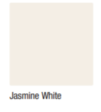

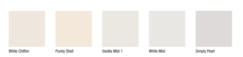
White Cotton and Jasmine White fall in to this category. White Chiffon looks more grey and White Cotton and Jasmine White have yellow and beige undertones
Warm whites. My personal favorites. These whites have yellow, peach or beige undertones. Also, these are great for pairing with warm interior styles like bohemian. They are the visual representation of a warm, soft hug. They look great on North facing walls which often get low light or bluish light.
Purely Shell Almond White
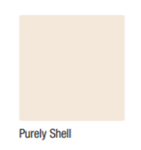
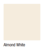
Off White, White Chiffon, Purely Shell, Natural Calico and Almond White all fall in to this category. Purely Shell has beige undertones and Off White is more yellow. Be careful with yellow whites because they run the risk of giving a yellow cast which might be unflattering in your space.
Last but not least is are the cool whites. That white you saw that also looked blue and maybe a little purple. That is a cool white, They have grey, blue, purple and even green undertones. They pair well with cool color palettes and modern interiors. They are also great for toning down the effects of yellow light. You have to be careful with these to avoid your space looking blue or like a jail cell.
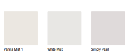
Vanilla Mist,White Mist and Simply pearl are all cool whites.
So the rule of thumb is pure whites for a crisp look, greige whites if you want a clean but creamy look or have a neutral color palette, warm whites for warm interiors and cool whites for cool interiors. There are exceptions to all rules, this is definitely not the only thing you should consider while choosing white paint.
RULE 2: FOLLOW THE LIGHT
Lighting is everything. It can take your white paint up by a notch or two and or make your room look dingy. The direction your windows face determine the kind of light you get. You probably cannot change the position of your window so you have to work with it. If you get a lot of grey light or the room is generally dark, you’d do better with a darker white, preferably a warm white. It may sound counter intuitive but a crisp white will have your room looking dreary and makes the darkness or grey more pronounced. Vice versa, if you have some yellow or warm light you don’t like, a cool or neutral cool white paint will do a good job of balancing things out. However, have warm light fixtures to keep things balanced on days the sky is generally overcast or at night.
Take Note; The buildings around your space may also affect the color of light you receive. A red building near your window means you may be getting red or pink light bounces in to your space. You can balance that out with cool or cool neutral paint.
TIPS
Before painting, make sure to do a test patch. This could save you from having to repaint the room or help you make a selection from a few shades. It is helpful to paint on a piece of water color or oil paint absorbent paper. Tape it up and move around the room to see how it looks in different lighting around the room. You may also paint directly on to the walls but I believe the paper trick saves you the effort of having to painting swatches in every corner.
IN CONCLUSION
Painting is an inexpensive way to change the feel of your space. But, it is annoying to have to do it twice because the color doesn’t look right. It is also not great to have your space look incoherent because your color palette and paint are not coming together visually. So I advice you to check your undertones, evaluate the kind of light you get and do a patch test always.
Let me know about your experience with white paint in the comment section.


2 Comments
Lord Jeff
November 19, 2020 at 7:36 amI love white as a primary colour for interior spaces because it’s perfect at distributing light farther within a room.
Warm and sometimes “greige” (I just learned that one) whites seem best if you’re going to populate your interior space with furniture and items which are in that range of natural colours (greys to browns to brownish reds and dark greens) and patterns.
I’d pick a cool blue if my priority is light. It’s usually a great back drop for bold coloured furniture and interior decor.
oluwakemiagbato
November 19, 2020 at 8:56 amCool whites or true whites work well with bold colors. Thank you for visiting the blog!